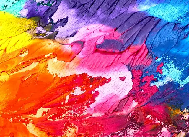
Colors play a significant role in influencing human emotions, perceptions, and behavior. They have a profound impact on mood, psychology, and design choices. Different colors evoke different feelings and can be used effectively in various contexts to create specific atmospheres.
Here’s a breakdown of some colors and their typical psychological effects:
- Red: Associated with energy, passion, and urgency. It can raise the heart rate and create a sense of excitement. It’s often used to draw attention or evoke strong emotions.
- Blue: Known for its calming and soothing effects. It’s associated with serenity, trust, and professionalism. Lighter shades of blue can create a sense of tranquility, while darker shades can signify stability and reliability.
- Yellow: Often linked to happiness, optimism, and energy. It can promote creativity and positivity but can also be overwhelming in large doses.
- Green: Symbolizes nature, growth, and harmony. It’s restful for the eyes and often associated with balance, health, and tranquility.
- Orange: Combines the energy of red and the cheerfulness of yellow. It represents enthusiasm, creativity, and determination. It’s vibrant and attention-grabbing.
- Purple: Often associated with luxury, creativity, and spirituality. Darker shades can evoke a sense of mystery and sophistication.
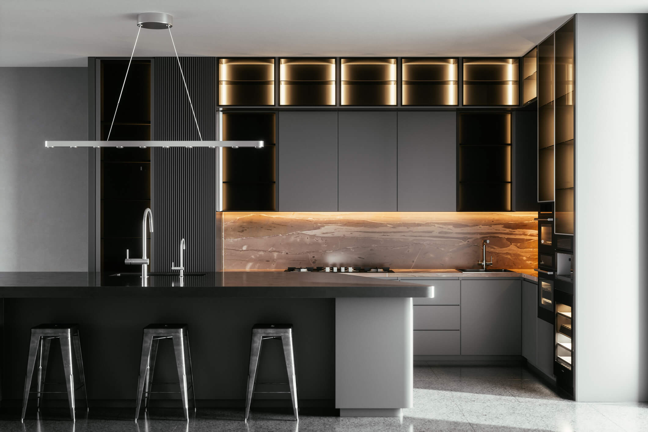
- Black: Signifies power, elegance, and formality. It’s versatile and can be used to create a sense of sophistication or even a sense of mystery.
- White: Represents purity, cleanliness, and simplicity. It’s often used in minimalistic designs and to create a sense of space and clarity.
- Gray: Symbolizes neutrality, balance, and practicality. It’s often used as a background color to emphasize other elements in the design.
When it comes to design choices, understanding color psychology is crucial.
Here are some principles:
- Purpose and Context: Consider the purpose of the space or design. Is it meant to be calming, stimulating, professional, or playful?
- Balance: Using a combination of colors can create balance and harmony in a design. This can involve the use of complementary or analogous colors.
- Contrast: Employing contrasting colors can create visual interest and help certain elements stand out.
- Cultural Significance: Different cultures might perceive colors differently. It’s essential to consider cultural contexts when using colors in designs or spaces.
- Personal Preference: Individuals might have personal associations with colors, so considering the preferences of the target audience is important.
Ultimately, the choice of colors in design should be intentional, taking into account the emotions and responses they may evoke in the audience or users. Combining various colors strategically can significantly impact the overall mood and ambiance of a space or design.